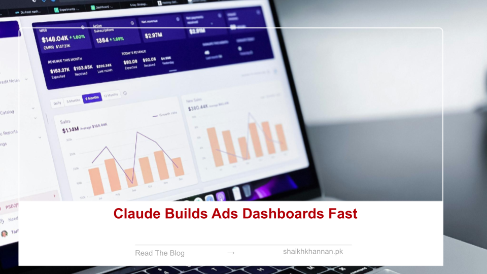
Claude builds live Google and Meta Ads dashboards in seconds — no Looker setup, no manual queries.
Last week I built seven different dashboards this way, and none of them took more than a single sentence to describe. Here’s what that actually looked like, and why it’s changed how I report on accounts.
Why bother when Looker already exists
Traditional dashboard setups take hours, and by the time they’re built, half the context has already changed. Live charts fix that — they update as the data does, instead of going stale the moment you take a screenshot.
How I connected it
I gave Claude read access to a Google Ads account and a Meta Ads account, typed a plain-English request, and got back a rendered dashboard in seconds — KPI tiles, trend lines, campaign breakdowns, the works. It felt less like using a BI tool and more like handing the work to an analyst who never gets tired of pulling reports.
Seven dashboards, one sentence each
Every one of these would’ve taken an hour or two to build manually. Instead, each took a single prompt.
1. Full account health
Spend, ROAS, CPA, CTR, and 90-day trends, with campaigns ranked by performance. Winners and losers are obvious at a glance, and the tiles update live as new clicks and conversions roll in.
2. PMax black box breakdown
Performance Max feels opaque to a lot of advertisers, so this one breaks out asset-group ROAS and flags the worst performers — plus surfaces search categories Google usually hides. It’s the closest thing I’ve found to actual control over a “black box” campaign type.
3. Quality Score deep dive
A scatter plot of every keyword, Quality Score against spend, with the worst offenders flagged automatically. Manual exports miss this pattern almost every time — it’s just too tedious to build by hand.
4. Search term waste audit
The top 50 search terms ranked by cost versus conversions, with negative keyword suggestions attached. This is the one that stops you paying for queries that were never going to convert.
5. Budget allocation optimizer
Current spend splits next to recommended ones, with projected ROAS lift modeled per shift. You get to test a reallocation before you actually touch a budget — which takes a lot of the risk out of it.
6. Auction insights competitive map
Your top five competitors, impression share trends, and exactly where you’re losing ground and what it’s costing you. Useful for planning bids without guessing at the landscape.
7. Weekly anomaly report
This week against last week, with anything moving more than 15% flagged in red. Sudden drops or spikes stop being something you notice three days late.
What this actually changes
Each dashboard is one sentence of setup. That alone saves hours a week, and the consistency makes cross-account reporting genuinely comparable instead of every report looking slightly different depending on who built it. The same setup works for Meta Ads too — same prompts, same speed.
Related reading:
- Why Creative Beats Bigger Budgets
- Stop Expecting Conversions Too Soon
- Claude Automates Meta Ads Management
- Facebook Ads Limits Marketers Must Know
- Track Budget Utilization in Google Ads
Helpful resources: